Lesson 04: Plotting
Objects
- Learn how to create and label two-dimensional plots
- Learn how to adjust the appearance of the plots
- Learn how to create three-dimensional plots
Background
It is difficult to understand the amount of data in a large array. No one can make sense of a thousand numbers displayed on the screen. However, graphing techniques can make the information in the array easier to understand. Plotting an array on the screen is an essential tool for understanding and interpreting the numerical results produced by a MATLAB program, and is also useful for debugging (finding errors in your program). With a graph, it is easy to identify trends, pick out highs and lows, and isolate data points that may be measurement or calculation errors.
Types of MATLAB Plots
Types of MATLAB Plots
| Line Plots | Data Distribution Plots | Discrete Data Plots | Geographic Plots | Polar Plots | Contour Plots | Vector Fields | Surface and Mesh Plots | Volume Visualization | Animation | Images |
|---|---|---|---|---|---|---|---|---|---|---|
|
plot |
histogram |
bar |
geobubble |
polarplot |
contour |
quiver |
surf |
streamline |
animatedline |
image |
|
plot3 |
histogram2 |
barh |
geoplot |
polarhistogram |
contourf |
quiver3 |
surfc |
streamslice |
comet |
imagesc |
|
stairs |
pie |
bar3 |
geoscatter |
polarscatter |
contour3 |
feather |
surfl |
streamparticles |
comet3 |
|
|
errorbar |
pie3 |
bar3h |
compass |
contourslice |
ribbon |
streamribbon |
||||
|
area |
scatter |
pareto |
ezpolar |
fcontour |
pcolor |
streamtube |
||||
|
stackedplot |
scatter3 |
stem |
fsurf |
coneplot |
||||||
|
loglog |
scatterhistogram |
stem3 |
fimplicit3 |
slice |
||||||
|
semilogx |
spy |
scatter |
mesh |
|||||||
|
semilogy |
plotmatrix |
scatter3 |
meshc |
|||||||
|
fplot |
heatmap |
stairs |
meshz |
|||||||
|
fplot3 |
wordcloud |
waterfall |
||||||||
|
fimplicit |
parallelplot |
fmesh |
4.1.1 Two-Dimensional Plots
Two-Dimensional Plots
Basic Plotting
Basic Plotting
| plot(X,Y) | Creates a 2-D line plot of the data in Y versus the corresponding values in X. |
| plot(X,Y,LineSpec) | Sets the line style, marker symbol, and color. |
- If X and Y are both vectors, then they must have equal lengths. The plot function plots Y versus X.
- If X and Y are both matrices, then they must have equal size. The plot function plots columns of Y versus columns of X.
- If one of X or Y is a vector and the other is a matrix, then the matrix must have dimensions such that one of its dimensions equals the vector length. If the number of matrix rows equals the vector length, then the plot function plots each matrix column versus the vector. If the number of matrix columns equals the vector length, then the function plots each matrix row versus the vector. If the matrix is square, then the function plots each column versus the vector.
- If one of X or Y is a scalar and the other is either a scalar or a vector, then the plot function plots discrete points. However, to see the points you must specify a marker symbol, for example, plot(X,Y,'o').
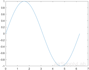
Create Line Plot
Create x as a vector of linearly spaced values between 0 and 2π. Use an increment of π/100 between the values. Create y as sine values of x. Create a line plot of the data.
| >> x = 0:pi/100:2*pi; >> y = sin(x); >> plot(x,y) |
 |
Creating Multiple Plots
| plot(X1,Y1,...,Xn,Yn) | Plots multiple X, Y pairs using the same axes for all lines. |
| plot(X1,Y1,LineSpec1,...,Xn,Yn,LineSpecn) | Sets the line style, marker type, and color for each line. You can mix X, Y, LineSpec triplets with X, Y pairs. For example, plot(X1,Y1,X2,Y2,LineSpec2,X3,Y3). |
| figure | Determines which figure will be used for the current plot. |
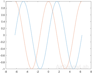
Plot Multiple Lines
Define x as 100 linearly spaced values between −2π and 2π. Define y1 and y2 as sine and cosine values of x. Create a line plot of both sets of data.
| >> x = linspace(-2*pi, 2*pi); >> y1 = sin(x); >> y2 = cos(x); >> figure >> plot(x, y1, x, y2) |
 |
Line, Color, and Mark Style
You can change the appearance of your plots by selecting user-defined line styles and line colors and by choosing to show the data points on the graph with user-specified mark styles.
| plot(Y) | Creates a 2-D line plot of the data in Y versus the index of each value. |
| plot(Y,LineSpec) | Sets the line style, marker symbol, and color. |
- If Y is a vector, then the x-axis scale ranges from 1 to length(Y).
- If Y is a matrix, then the plot function plots the columns of Y versus their row number. The x-axis scale ranges from 1 to the number of rows in Y.
- If Y is complex, then the plot function plots the imaginary part of Y versus the real part of Y, such that plot(Y) is equivalent to plot(real(Y),imag(Y)).
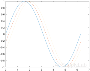
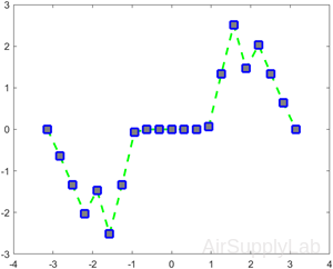
Specify Line Style
Plot three sine curves with a small phase shift between each line. Use the default line style for the first line. Specify a dashed line style for the second line and a dotted line style for the third line.
| >> x = 0:pi/100:2*pi; >> y1 = sin(x); >> y2 = sin(x-0.25); >> y3 = sin(x-0.5); >> figure >> plot(x, y1, x, y2,'--',x,y3,':') |
 |
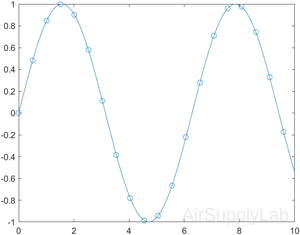
Specify Line Style, Color, and Marker
Create a line plot and display markers at every fifth data point by specifying a marker symbol and setting the MarkerIndices property as a name-value pair.
| >> x = linspace(0, 10); >> y = sin(x); >> y2 = cos(x); >> figure >> plot(x, y,'-o','MarkerIndices',1:5:length(y)) |
 |
Specify Line Width, Marker Size, and Marker Color
Create a line plot and use the LineSpec option to specify a dashed green line with square markers. Use Name,Value pairs to specify the line width, marker size, and marker colors. Set the marker edge color to blue and set the marker face color using an RGB color value.
| >> x = -pi:pi/10:pi; >> y = tan(sin(x)) - sin(tan(x)); >> figure >> plot(x,y,'--gs',... 'LineWidth',2,... 'MarkerSize',10,... 'MarkerEdgeColor','b',... 'MarkerFaceColor',[0.5,0.5,0.5]) |
 |
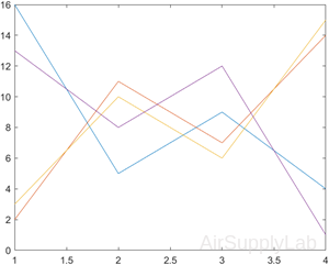
Create Line Plot From Matrix
Define Y as the 4×4 matrix returned by the magic function. Create a 2-D line plot of Y. MATLAB plots each matrix column as a separate line.
| >> Y = magic (4) Y = 16 2 3 13 5 11 10 8 9 7 6 12 4 14 15 1 >> figure >> plot(Y) |
 |
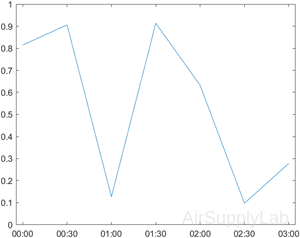
Plot Durations and Specify Tick Format
Define t as seven linearly spaced duration values between 0 and 3 minutes. Plot random data and specify the format of the duration tick marks using the 'DurationTickFormat' name-value pair argument.
| >> t = 0:seconds(30):minutes(3); >> y = rand(1,7); >> plot(t,y,'DurationTickFormat','mm:ss') |
 |
Modify Lines After Creation
Define x as 100 linearly spaced values between −2π and 2π. Define y1 and y2 as sine and cosine values of x. Create a line plot of both sets of data and return the two chart lines in p.
| >> x = linspace(-2*pi,2*pi); >> y1 = sin(x); >> y2 = cos(x); >> p = plot(x,y1,x,y2); |
|
Change the line width of the first line to 2. Add star markers to the second line. Starting in R2014b, you can use dot notation to set properties. If you are using an earlier release, use the set function instead.
| >> p(1).LineWidth = 2; >> p(2).Marker = '*'; |
 |
Title and Labels
| plot(___,Name,Value) | Specifies line properties using one or more Name,Value pair arguments. For a list of properties, see Line Properties. Use this option with any of the input argument combinations in the previous syntaxes. Name-value pair settings apply to all the lines plotted. |
| title('string') | Adds a title to a plot. |
| xlabel ('string') | Adds a label to the x-axis |
| ylabel ('string') | Adds a label to the y-axis |
| grid grid on grid off |
Adds a grid to the graph. |
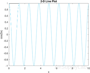
Add Title and Axis Labels
Use the linspace function to define x as a vector of 150 values between 0 and 10. Define y as cosine values of x.
Create a 2-D line plot of the cosine curve. Change the line color to a shade of blue-green using an RGB color value. Add a title and axis labels to the graph using the title, xlabel, and ylabel functions.
| >> x = linspace(0,10,150); >> y = cos(5*x); >> figure >> plot(x,y,'Color',[0,0.7,0.9]) >> title('2-D Line Plot') >> xlabel('x') >> ylabel('cos(5x)') |
 |
Axis Scaling and Annotating Plots
| axis | When the axis function is used without inputs, it freezes the axis at the current configuration. Executing the function a second time returns axis control to MATLAB. |
| axis (v) | The input to the axis command must be a four-element vector that specifies the minimum and maximum values for both the x- and y-axes—for example, [xmin, xmax,ymin,ymax]. |
| axis equal | Forces the scaling on the x- and y-axis to be the same. |
| legend('string1', 'string 2', etc) | Allows you to add a legend to your graph. The legend shows a sample of the line and lists the string you have specified. |
| text(x_coordinate,y_coordinate, 'string') |
Allows you to add a text box to the graph. The box is placed at the specified x- and y-coordinates and contains the string value specified. |
| gtext('string') | Similar to text. The box is placed at a location determined interactively by the user by clicking in the figure window. |
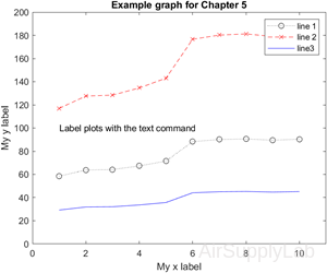
Annotated with a Legend
| >> x = [1:10]; >> y =[58.5, 63.8, 64.2, 67.3, ... 71.5, 88.3, 90.1, 90.6, ... 89.5,90.4]; >> plot(x,y,':ok',x,y*2,'--xr',x,y/2,'-b') >> legend('line 1', 'line 2', 'line3') >> text(1,100,'Label plots with the text command') >> xlabel('My x label'), ylabel('My y label') >> title('Example graph for Chapter 5') >> axis([0,11,0,200]) |
 |
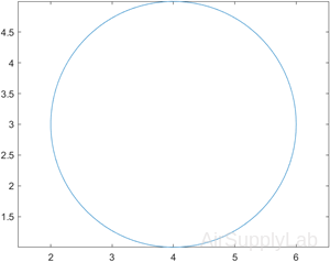
Plot Circle
Plot a circle centered at the point (4,3) with a radius equal to 2. Use axis equal to use equal data units along each coordinate direction.
| >> r = 2; >> xc = 4; >> yc = 3; >> theta = linspace(0,2*pi); >> x = r*cos(theta) + xc; >> y = r*sin(theta) + yc; >> plot(x,y) >> axis equal |
 |
LineSpec — Line style, marker, and color
Line style, marker, and color, specified as a character vector or string containing symbols. The symbols can appear in any order. You do not need to specify all three characteristics (line style, marker, and color). For example, if you omit the line style and specify the marker, then the plot shows only the marker and no line.
Example: '--or' is a red dashed line with circle markers
| Line Style | Description | Resulting Line |
|---|---|---|
| - | Solid line (default) |  |
| -- | Dashed line |  |
| : | Dotted line |  |
| -. | Dash-dot line |  |
| none | No line |
| Marker | Description |
|---|---|
| o | Circle |
| + | Plus sign |
| * | Asterisk (star) |
| . | Point |
| x | Cross (x-mark) |
| s | Square |
| d | Diamond |
| ^ | Upward-pointing triangle |
| v | Downward-pointing triangle |
| > | Right-pointing triangle |
| < | Left-pointing triangle |
| p | Pentagram |
| h | Hexagram |
| Color | Description |
|---|---|
| y | yellow |
| m | magenta |
| c | cyan |
| r | red |
| g | green |
| b | blue |
| w | white |
| k | black |
Practice Exercise 4.1.1
- Plot x versus y for y = sin(x). Let x vary from 0 to 2π in increments of 0.1π. Add a title and labels to your plot.
- Plot x versus y1 and y2 for y1 = sin(x) and y2 = cos(x). Let x vary from 0 to 2π in increments of 0.1π. Add a title and labels to your plot.
- Re-create the plot from Exercise 2, but make the sin(x) line dashed and red. Make the cos(x) line green and dotted.
- Add a legend to the graph in Exercise 3. And adjust the axes so that the x-axis goes from -1 to 2π+1 and the y-axis from -1.5 to +1.5.
4.1.2 Subplots
Subplots
| subplot(m,n,p) | Allows you to subdivide the graphing window into a grid of m rows and n columns. The variable p identifies the portion of the window where the next plot will be drawn. |
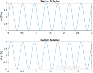
Upper and Lower Subplots
Create a figure with two subplots and return the Axes objects as ax1 and ax2. Create a 2-D line plot in each axes by referring to the Axes objects. Add a title and y-axis label to each axes by passing the Axes objects to the title and ylabel functions.
| >> ax1 = subplot(2,1,1); % top subplot >> x = linspace(0,3); >> y1 = sin(5*x); >> plot(ax1,x,y1) >> title(ax1,'Top Subplot') >> ylabel(ax1,'sin(5x)') >> ax2 = subplot(2,1,2); % bottom subplot >> y2 = sin(15*x); >> plot(ax2,x,y2) >> title(ax2,'Bottom Subplot') >> ylabel(ax2,'sin(15x)') |
 |
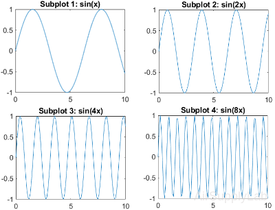
Quadrant of Subplots
Create a figure divided into four subplots. Plot a sine wave in each one and title each subplot.
| >> subplot(2,2,1) >> x = linspace(0,10); >> y1 = sin(x); >> plot(x,y1) >> title('Subplot 1: sin(x)') >> subplot(2,2,2) >> y2 = sin(2*x); >> plot(x,y2) >> title('Subplot 2: sin(2x)') >> subplot(2,2,3) >> y3 = sin(4*x); >> plot(x,y3) >> title('Subplot 3: sin(4x)') >> subplot(2,2,4) >> y4 = sin(8*x); >> plot(x,y4) >> title('Subplot 4: sin(8x)') |
 |
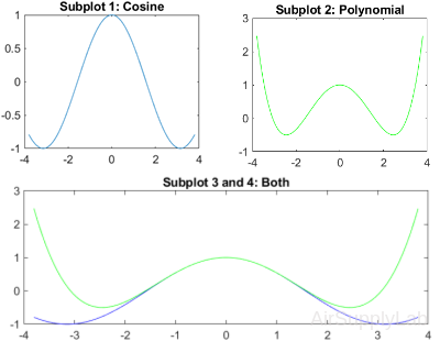
Subplots with Different Sizes
Create a figure containing with three subplots. Create two subplots across the upper half of the figure and a third subplot that spans the lower half of the figure. Add titles to each subplot.
| >> subplot(2,2,1); >> x = linspace(-3.8,3.8); >> y_cos = cos(x); >> plot(x,y_cos); >> title('Subplot 1: Cosine') >> subplot(2,2,2); >> y_poly = 1 - x.^2./2 + x.^4./24; >> plot(x,y_poly,'g'); >> title('Subplot 2: Polynomial') >> subplot(2,2,[3,4]); >> plot(x,y_cos,'b',x,y_poly,'g'); >> title('Subplot 3 and 4: Both') |
 |
Practice Exercise 4.1.2
- Subdivide a figure window into two rows and one column.
- In the top window, plot y = tan(x) for -1.5 ≤ x ≤ 1.5. Use an increment of 0.1. Add a title and axis labels to your graph.
- In the bottom window, plot y = sin(x) for the same range. Add a title and labels to your graph.
- Redo exercise 1 again, but divide the figure window vertically instead of horizontally (one row, two columns).
4.1.3 Other Types of Two-Dimensional Plots
Other Types of Two-Dimensional Plots
| polarplot (x,y) | Plot specified object parameters on polar coordinates. |
| semilogx(x,y) | Generates a plot of the values of x and y, using a logarithmic scale for x and a linear scale for y. |
| semilogy(x,y) | Generates a plot of the values of x and y, using a linear scale for x and a logarithmic scale for y. |
| loglog(x,y) | Generates a plot of the vectors x and y, using a logarithmic scale for both x and y. |
Polar Plots
Polar Plots
polarplot(theta,rho)
Plots a line in polar coordinates, with theta indicating the angle in radians and rho indicating the radius value for each point. The inputs must be vectors with equal length or matrices with equal size. If the inputs are matrices, then polarplot plots columns of rho versus columns of theta. Alternatively, one of the inputs can be a vector and the other a matrix as long as the vector is the same length as one dimension of the matrix.
polarplot(theta,rho,LineSpec)
Sets the line style, marker symbol, and color for the line.
polarplot(theta1,rho1,...,thetaN,rhoN)
Plots multiple rho,theta pairs.
polarplot(theta1,rho1,LineSpec1,...,thetaN,rhoN,LineSpecN)
Specifies the line style, marker symbol, and color for each line.
polarplot(rho)
Plots the radius values in rho at evenly spaced angles between 0 and 2π.
polarplot(rho,LineSpec)
Sets the line style, marker symbol, and color for the line.
polarplot(Z)
Plots the complex values in Z.
polarplot(Z,LineSpec)
Sets the line style, marker symbol, and color for the line.
polarplot(___,Name,Value)
Specifies properties of the chart line using one or more Name, Value pair arguments. The property settings apply to all the lines. You cannot specify different property values for different lines using Name, Value pairs.
polarplot(pax,___)
Uses the PolarAxes object specified by pax, instead of the current axes.
p = polarplot(__)
Returns one or more chart line objects. Use p to set properties of a specific chart line object after it is created. For a list of properties, see Line Properties.
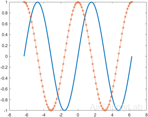
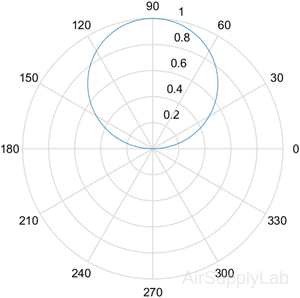
Create Polar Plots
Generates a polar plot of angle theta (in radians) and radial distance r.
| >> theta = 0: pi/100:pi; >> y = sin(theta); >> polarplot (theta, y) |
 |
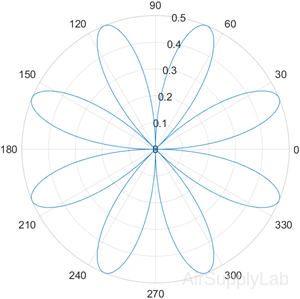
| >> theta = 0:0.01:2*pi; >> rho = sin(2*theta).*cos(2*theta); >> polarplot(theta,rho) |
 |
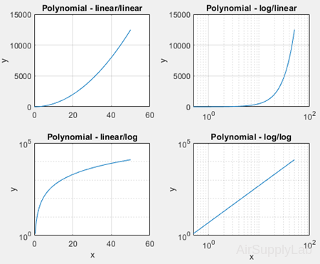
Logarithmic Plots
Logarithmic Plots
A logarithmic scale (to the base 10) is convenient when a variable ranges over many orders of magnitude because the wide range of values can be graphed without compressing the smaller values. Logarithmic plots are also useful for representing data that vary exponentially.
The logarithm of a negative number or of zero does not exist. If your data include these values, MATLAB ® will issue a warning message and will not plot the points in question.
Logarithmic Plots
| >> x = 0:0.5:50; x = 0:0.5:50; y = 5*x.^2; >> subplot(2,2,1) >> plot(x,y) >> title('Polynomial - linear/linear') >> ylabel('y'), grid >> subplot(2,2,2) >> semilogx(x,y) >> title('Polynomial - log/linear') >> ylabel('y'), grid >> subplot(2,2,3) >> semilogy(x,y) >> title('Polynomial - linear/log') >> xlabel('x'), ylabel('y'), grid >> subplot(2,2,4) >> loglog(x,y) >> title('Polynomial - log/log') >> xlabel('x'), ylabel('y'), grid |
 |
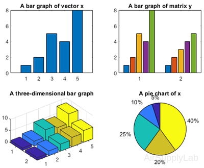
Bat Graphs, Pie Charts and Histograms
Bar Graphs and Pie Charts
Bar graphs, histograms, and pie charts are popular forms for reporting data.
| bar(x) | When x is a vector, bar generates a vertical bar graph. When x is a two-dimensional matrix, bar groups the data by row. |
| barh(x) | When x is a vector, barh generates a horizontal bar graph. When x is a two-dimensional matrix, barh groups the data by row. |
| bar3(x) | Generates a three-dimensional bar chart. |
| bar3h(x) | Generates a three-dimensional horizontal bar chart. |
| pie(x) | Generates a pie chart. Each element in the matrix is represented as a slice of the pie. |
| pie3(x) | Generates a three-dimensional pie chart. Each element in the matrix is represented as a slice of the pie. |
| hist(x) | Generates a histogram |
Bar Graphs and Pie Charts
| >> clear, clc >> x = [1,2,5,4,8]; y = [x;1:5]; >> subplot(2,2,1) >> bar(x),title('A bar graph of vector x') >> subplot(2,2,2) >> bar(y),title('A bar graph of matrix y') >> subplot(2,2,3) >> bar3(y),title('A three-dimensional bar graph') >> subplot(2,2,4) >> pie(x),title('A pie chart of x') |
 |
Histogram Plot
Histogram Plot
Histograms are a type of bar plot for numeric data that group the data into bins. After you create a Histogram object, you can modify aspects of the histogram by changing its property values. This is particularly useful for quickly modifying the properties of the bins or changing the display.
histogram(X)
Creates a histogram plot of X. The histogram function uses an automatic binning algorithm that returns bins with a uniform width, chosen to cover the range of elements in X and reveal the underlying shape of the distribution. The histogram displays the bins as rectangles such that the height of each rectangle indicates the number of elements in the bin.
histogram(X,nbins)
Uses a number of bins specified by the scalar, nbins.
histogram(X,edges)
Sorts X into bins with the bin edges specified by the vector, edges. Each bin includes the left edge but does not include the right edge, except for the last bin which includes both edges.
histogram('BinEdges',edges,'BinCounts',counts)
Manually specifies bin edges and associated bin counts. histogram plots the specified bin counts and does not do any data binning.
histogram(C)
Where C is a categorical array, plots a histogram with a bar for each category in C.
histogram(C,Categories)
Plots only the subset of categories specified by Categories.
histogram('Categories',Categories,'BinCounts',counts)
Manually specifies categories and associated bin counts. histogram plots the specified bin counts and does not do any data binning.
histogram(___,Name,Value)
Specifies additional options with one or more Name, Value pair arguments using any of the previous syntaxes. For example, you can specify 'BinWidth' and a scalar to adjust the width of the bins, or 'Normalization' with a valid option ('count', 'probability', 'countdensity', 'pdf', 'cumcount', or 'cdf') to use a different type of normalization. For a list of properties, see Histogram Properties.
histogram(ax,___)
Plots into the axes specified by ax instead of into the current axes (gca). The option ax can precede any of the input argument combinations in the previous syntaxes.
h = histogram(__)
Returns a Histogram object. Use this to inspect and adjust the properties of the histogram. For a list of properties, see Histogram Properties
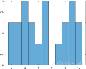
Histogram of Vector
A histogram is a special type of graph that is particularly useful for the statistical analysis of data. It is a plot showing the distribution of a set of values. In MATLAB, the histogram computes the number of values falling into 10 bins (categories) that are equally spaced between the minimum and maximum values.
| >> x = [0 2 9 2 5 8 7 3 1 9 4 3 5 8 10 0 1 2 9 5 10]; >> histogram(x) |
 |
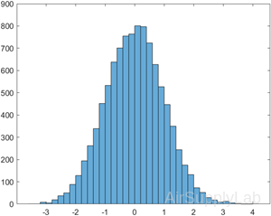
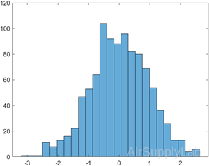
Generate 10,000 random numbers and create a histogram. The histogram function automatically chooses an appropriate number of bins to cover the range of values in x and show the shape of the underlying distribution.
| >> x = randn(1000,1); >> h = histogram(x) h = Histogram with properties: Data: [10000×1 double] Values: [1×39 double] NumBins: 39 BinEdges: [1×40 double] BinWidth: 0.2000 BinLimits: [-3.6000 4.2000] Normalization: 'count' FaceColor: 'auto' EdgeColor: [0 0 0] Show all properties |
 |
When you specify an output argument to the histogram function, it returns a histogram object. You can use this object to inspect the properties of the histogram, such as the number of bins or the width of the bins.
Find the number of histogram bins.
>> nbins = h.NumBins
nbins = 37
Specify Number of Histogram Bins
Plot a histogram of 1,000 random numbers sorted into 25 equally spaced bins
| >> x = randn(1000,1); >> nbins = 25; >> h = histogram(x,nbins) h = Histogram with properties: Data: [1000×1 double] Values: [1×25 double] NumBins: 25 BinEdges: [1×26 double] BinWidth: 0.2330 BinLimits: [-3.2000 2.6250] Normalization: 'count' FaceColor: 'auto' EdgeColor: [0 0 0] Show all properties |
 |
Find the bin counts
>> counts = h.Values
counts = 1×25
1 3 0 6 14 19 31 54 74 80 92 122 104 115 88 80 38 32 21 9 5 5 5 0 2
Specify Bin Edges of Histogram
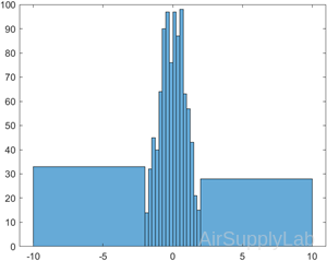
Generate 1,000 random numbers and create a histogram. Specify the bin edges as a vector with wide bins on the edges of the histogram to capture the outliers that do not satisfy \(\left| x \right| < 2\). The first vector element is the left edge of the first bin, and the last vector element is the right edge of the last bin.
| >> x = randn(1000,1); >> edges = [-10 -2:0.25:2 10]; >> h = histogram(x,edges); |
 |
Specify the Normalization property as 'countdensity' to flatten out the bins containing the outliers. Now, the area of each bin (rather than the height) represents the frequency of observations in that interval.
| >> h.Normalization = 'countdensity'; | 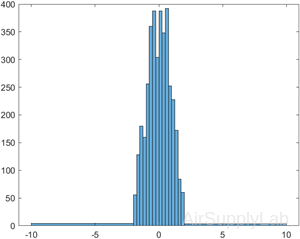 |
Histogram with Specified Normalization
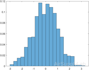
Generate 1,000 random numbers and create a histogram using the 'probability' normalization.
| >> x = randn(1000,1); >> h = histogram(x,'Normalization','probability') h = Histogram with properties: Data: [1000×1 double] Values: [1×21 double] NumBins: 21 BinEdges: [1×22 double] BinWidth: 0.3 BinLimits: [-3.0000 3.3000] Normalization: 'probability' FaceColor: 'auto' EdgeColor: [0 0 0] Show all properties |
 |
Compute the sum of the bar heights. With this normalization, the height of each bar is equal to the probability of selecting an observation within that bin interval, and the height of all of the bars sums to 1.
>> S = sum(h.Values)
S = 1
Plot Multiple Histograms
Generate two vectors of random numbers and plot a histogram for each vector in the same figure.
| >> x = randn(2000,1); >> y = 1 + randn(5000,1); >> h1 = histogram(x); >> hold on >> h2 = histogram(y); |
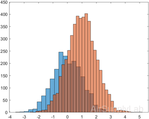 |
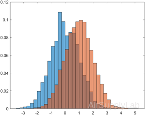
Since the sample size and bin width of the histograms are different, it is difficult to compare them. Normalize the histograms so that all of the bar heights add to 1, and use a uniform bin width.
| >> h1.Normalization = 'probability'; >> h1.BinWidth = 0.25; >> h2.Normalization = 'probability'; >> h2.BinWidth = 0.25; |
 |
Function Plots
Function Plots
The fplot function allows you to plot a function without defining arrays of corresponding x- and y-values.
| fplot(f) | Plots the curve defined by the function y = f(x) over the default interval [-5 5] for x. |
| fplot(f,xinterval) | Plots over the specified interval. Specify the interval as a two-element vector of the form [xmin xmax]. |
| fplot(funx,funy) | Plots the curve defined by x = funx(t) and y = funy(t) over the default interval [-5 5] for t. |
| fplot(funx,funy,tinterval) | Plots over the specified interval. Specify the interval as a two-element vector of the form [tmin tmax]. |
Plot Expression
Plot sin(x) over the default x interval [-5 5].
| >> fplot(@(x) sin(x)) | 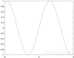 |
| >> fplot(@(x) sin(x),[-2*pi,2*pi]) | 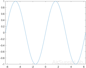 |
Practice Exercise 4.1.3
- Define an array called theta, from 0 to 2π, in steps of 0.01π. Define an array of distances r = 5*cos(4*theta). Make a polar plot of theta versus r.
- Create a plot of the functions that follow, using fplot. Don’t forget to title and label your graphs.
- \(f(t) = 5{t^2}\quad , - 3 \le t \le + 3\)
- \(f(t) = 5{\sin ^2}(t) + t{\cos ^2}(t)\quad , - 2\pi \le t \le 2\pi\)
- \(f(t) = t{e^t}\quad ,0 \le t \le 10\)
- \(f(t) = \ln (t) + \sin (t)\quad ,0 \le t \le 10\pi\)
4.2 Three-Dimensional Plots
| plot3(x,y,z) | Creates a three-dimensional line plot. |
| comet3(x,y,z) | Generates an animated version of plot3. |
| mesh(x) mesh(x,y,z) |
Creates a meshed surface plot. |
| surf(x) surf(x,y,z) |
Creates a surface plot; similar to the mesh function |
| shading interp | Interpolates between the colors used to illustrate surface plots |
| shading flat | Colors each grid section with a solid color |
| colormap(map_name) | Allows the user to select the color pattern used on surface plots |
| contour(z) contour(x,y,z) |
Generates a contour plot |
| surfc(z) surfc(x,y,z |
Creates a combined surface plot and contour plot |
| pcolor(z) pcolor(x,y,z |
Creates a pseudo color plot |
3-D Line Plot
Plots coordinates in 3-D space.
- To plot a set of coordinates connected by line segments, specify X, Y, and Z as vectors of the same length.
- To plot multiple sets of coordinates on the same set of axes, specify at least one of X, Y, or Z as a matrix and the others as vectors.
plot3(X,Y,Z,LineSpec)
Creates the plot using the specified line style, marker, and color.
plot3(X1,Y1,Z1,...,Xn,Yn,Zn)
Plots multiple sets of coordinates on the same set of axes. Use this syntax as an alternative to specifying multiple sets as matrices.
plot3(X1,Y1,Z1,LineSpec1,...,Xn,Yn,Zn,LineSpecn)
Assigns specific line styles, markers, and colors to each XYZ triplet. You can specify LineSpec for some triplets and omit it for others.
For example, plot3(X1,Y1,Z1,'o',X2,Y2,Z2) specifies markers for the first triplet but not the for the second triplet.
plot3(___,Name,Value)
Specifies Line properties using one or more name-value pair arguments. Specify the properties after all other input arguments.
plot3(ax,___)
Displays the plot in the target axes. Specify the axes as the first argument in any of the previous syntaxes.
p = plot3(__)
Returns a Line object or an array of Line objects. Use p to modify properties of the plot after creating it.
Plot 3-D Line Plot
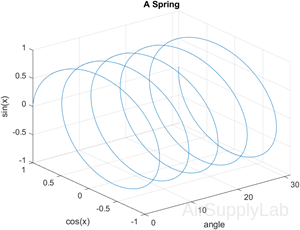
| >> close all, clear, clc >> x = linspace(0,10*pi,1000); >> y = cos(x); >> z = sin(x); >> plot3(x,y,z) >> grid >> xlabel('angle'), ylabel('cos(x)'), zlabel('sin(x)') >> title('A Spring') |
 |
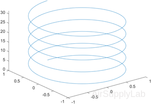
Plot 3-D Helix
Define t as a vector of values between 0 and 10π. Define st and ct as vectors of sine and cosine values. Then plot st, ct, and t.
| >> t = 0:pi/50:10*pi; >> st = sin(t); >> ct = cos(t); >> plot3(st,ct,t) |
 |
Plot Multiple Lines
Create two sets of x-, y-, and z-coordinates. Then call the plot3 function, and specify consecutive XYZ triplets.
| >> t = 0:pi/500:pi; >> xt1 = sin(t).*cos(10*t); >> yt1 = sin(t).*sin(10*t); >> zt1 = cos(t); >> xt2 = sin(t).*cos(12*t); >> yt2 = sin(t).*sin(12*t); >> zt2 = cos(t); >> plot3(xt1,yt1,zt1,xt2,yt2,zt2) |
 |
Plot Multiple Lines Using Matrices
Create matrix X containing three rows of x-coordinates. Create matrix Y containing three rows of y-coordinates. Then create matrix Z containing the z-coordinates for all three sets and plot all three sets of coordinates on the same set of axes.
| >> t = 0:pi/500:pi; >> X(1,:) = sin(t).*cos(10*t); >> X(2,:) = sin(t).*cos(12*t); >> X(3,:) = sin(t).*cos(20*t); >> Y(1,:) = sin(t).*sin(10*t); >> Y(2,:) = sin(t).*sin(12*t); >> Y(3,:) = sin(t).*sin(20*t); >> Z = cos(t); >> plot3(X,Y,Z) |
 |
Specify Equally-Spaced Tick Units and Axis Labels
Create vectors xt, yt, and zt. Plot the data, and use the axis equal command to space the tick units equally along each axis. Then specify the labels for each axis.
| >> t = 0:pi/500:40*pi; >> xt = (3 + cos(sqrt(32)*t)).*cos(t); >> yt = sin(sqrt(32) * t); >> zt = (3 + cos(sqrt(32)*t)).*sin(t); >> >> plot3(xt,yt,zt) >> axis equal >> xlabel('x(t)') >> ylabel('y(t)') >> zlabel('z(t)') |
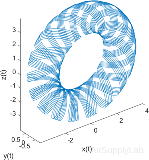 |
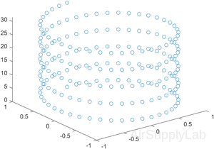
Plot Points as Markers Without Lines
Create vectors t, xt, and yt, and plot the points in those vectors using circular markers.
| >> t = 0:pi/20:10*pi; >> xt = sin(t); >> yt = cos(t); >> plot3(xt,yt,t,'o') |
 |
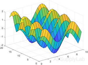
Surface Plots
Surface plots allow us to represent data as a surface. We will be experimenting with two types of surface plots: mesh plots and surf plots.
Mesh Plots
mesh(X,Y,Z)
Draws a wireframe mesh with color determined by Z, so color is proportional to surface height.
- If X and Y are vectors, length(X) = n and length(Y) = m, where [m,n] = size(Z). In this case, (X(j), Y(i), Z(i,j)) are the intersections of the wireframe grid lines; X and Y correspond to the columns and rows of Z, respectively.
- If X and Y are matrices, (X(i,j), Y(i,j), Z(i,j)) are the intersections of the wireframe grid lines. The values in X, Y, or Z can be numeric, datetime, duration, or categorical values.
mesh(Z)
draws a wireframe mesh using X = 1:n and Y = 1:m, where [m,n] = size(Z). The height, Z, is a single-valued function defined over a rectangular grid. Color is proportional to surface height. The values in Z can be numeric, datetime, duration, or categorical values.
mesh(...,C)
Draws a wireframe mesh with color determined by matrix C. MATLAB performs a linear transformation on the data in C to obtain colors from the current colormap. If X, Y, and Z are matrices, they must be the same size as C.
mesh(...,'PropertyName',PropertyValue,...)
Sets the value of the specified surface property. Multiple property values can be set with a single statement.
mesh(axes_handles,...)
Plots into the axes with handle axes_handle instead of the current axes (gca).
s = mesh(...)
Returns a Surface Properties object.
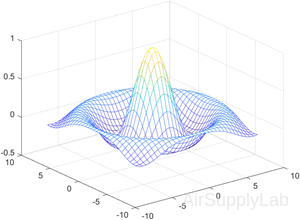
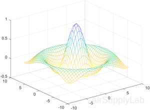
Create Mesh Plot of Sinc Function
Create a mesh plot of the sinc function, \(z=sin(r)/r\).
| >> [X,Y] = meshgrid(-8:.5:8); >> R = sqrt(X.^2 + Y.^2) + eps; >> Z = sin(R)./R; >> mesh(X,Y,Z) |
 |
| %Specify a color matrix for a mesh plot. >> C = gradient(Z); >> figure >> mesh(X,Y,Z,C) |
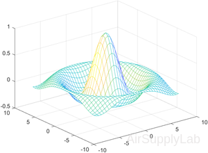 |
| % Change the lighting and the line width for a mesh plot using Name,Value pair arguments. >> C = del2(Z); >> figure >> mesh(X,Y,Z,C,'FaceLighting',... 'gouraud',... 'LineWidth',0.3) |
 |
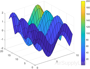
Surf Plots
Surf plots are similar to mesh plots, but surf creates a three-dimensional colored surface instead of a mesh. The colors vary with the value of z.
surf(X,Y,Z)
Creates a three-dimensional surface plot. The function plots the values in matrix Z as heights above a grid in the x-y plane defined by X and Y. The function also uses Z for the color data, so color is proportional to height.
surf(X,Y,Z,C)
Additionally specifies the surface color.
surf(Z)
Creates a surface and uses the column and row indices of the elements in Z as the x and y coordinates, respectively.
surf(Z,C)
Additionally specifies the surface color.
surf(ax,___)
Plots into the axes specified by ax instead of the current axes. Specify the axes as the first input argument.
surf(___,Name,Value)
Specifies surface properties using one or more name-value pair arguments.
For example, 'FaceAlpha',0.5 creates a semitransparent surface. Specify name-value pairs after all other input arguments.
s = surf(__)
Returns the chart surface object. Use s to modify the surface after it is created. For a list, see Surface Properties.
Create Surface Plot
Create X, Y, and Z as matrices of the same size. Then plot the data as a surface. The surface uses Z for both the height and color data.
| >> [X,Y] = meshgrid(1:0.5:10,1:20); >> Z = sin(X) + cos(Y); >> surf(X,Y,Z) |
 |
| % Specify the colors for a surface plot by including a fourth matrix input, C. >> C = X.*Y; >> surf(X,Y,Z,C) >> colorbar |
 |
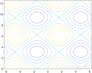
Contour Plots
Contour Plots
Contour plots are two-dimensional representations of three-dimensional surfaces, much like the familiar contour maps used by many hikers.
contour(Z)
Creates a contour plot containing the isolines of matrix Z, where Z contains height values on the x-y plane. MATLAB automatically selects the contour lines to display. The row and column indices of Z are the x and y coordinates in the plane, respectively.
contour(X,Y,Z)
Specifies the x and y coordinates for the values in Z.
contour(___,levels)
Specifies the contour lines to display as the last argument in any of the previous syntaxes. Specify levels as a scalar value n to display the contour lines at n automatically chosen levels (heights). To draw the contour lines at specific heights, specify levels as a vector of monotonically increasing values. To draw the contours at one height (k), specify levels as a two-element row vector [k k].
contour(___,LineSpec)
Specifies the style and color of the contour lines.
contour(___,Name,Value)
Specifies additional options for the contour plot using one or more name-value pair arguments. Specify the options after all other input arguments. For a list of properties, see Contour Properties.
contour(ax,___)
Displays the contour plot in the target axes. Specify the axes as the first argument in any of the previous syntaxes.
M = contour(__)
Returns the contour matrix M, which contains the (x, y) coordinates of the vertices at each level.
[M,c] = contour(__)
Returns the contour matrix and the contour object c. Use c to set properties after displaying the contour plot.
Contours of a Function
Create matrices X and Y, that define a grid in the x-y plane. Define matrix Z as the heights above that grid. Then plot the contours of Z.
| >> x = linspace(-2*pi,2*pi); >> y = linspace(0,4*pi); >> [X,Y] = meshgrid(x,y); >> Z = sin(X)+cos(Y); >> contour(X,Y,Z) |
 |
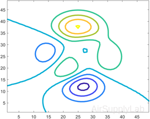
Contours at Twenty Levels
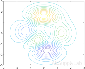
Define Z as a function of X and Y. In this case, call the peaks function to create X, Y, and Z. Then plot 20 contours of Z.
| >> [X,Y,Z] = peaks; >> contour(X,Y,Z,20) |
 |
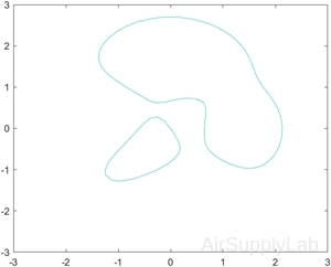
Contours at One Level
Display the contours of the peaks function at Z = 1.
| >> [X,Y,Z] = peaks; >> v = [1,1]; >> contour(X,Y,Z,v) |
 |
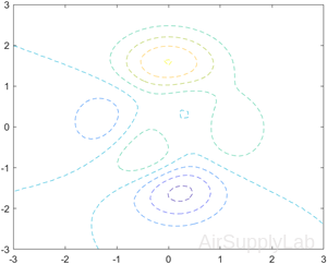
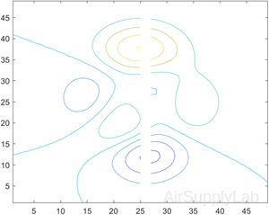
Dashed Contour Lines
Create a contour plot of the peaks function, and specify the dashed line style.
| >> [X,Y,Z] = peaks; >> contour(X,Y,Z,'--') |
 |
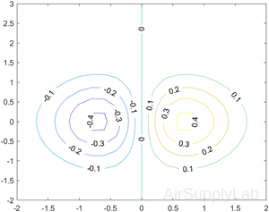
Contours with Labels
Define Z as a function of two variables, X and Y. Then create a contour plot of that function, and display the labels by setting the ShowText property to 'on'.
| >> x = -2:0.2:2; >> y = -2:0.2:3; >> [X,Y] = meshgrid(x,y); >> Z = X.*exp(-X.^2-Y.^2); >> contour(X,Y,Z,'ShowText','on') |
 |
Custom Line Width
Create a contour plot of the peaks function. Make the contour lines thicker by setting the LineWidth property to 3.
| >> Z = peaks; >> [M,c] = contour(Z); >> c.LineWidth = 3; |
 |
Contours Over Discontinuous Surface
Insert NaN values wherever there are discontinuities on a surface. The contour function does not draw contour lines in those regions.
Define matrix Z as a sampling of the peaks function. Replace all values in column 26 with NaN values. Then plot the contours of the modified Z matrix.
| >> Z = peaks; >> Z(:,26) = NaN; >> contour(Z) |
 |
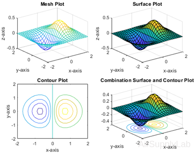
Surface and Contour Plots
>> x= [-2:0.2:2];
>> y= [-2:0.2:2];
>> [X,Y] = meshgrid(x,y);
>> Z = X.*exp(-X.^2 - Y.^2);
>>
>> subplot(2,2,1)
>> mesh(X,Y,Z)
>> title('Mesh Plot'), xlabel('x-axis'), ylabel('y-axis'), zlabel('z-axis')
>>
>> subplot(2,2,2)
>> surf(X,Y,Z)
>> title('Surface Plot'), xlabel('x-axis'), ylabel('y-axis'), zlabel('z-axis')
>>
>> subplot(2,2,3)
>> contour(X,Y,Z)
>> xlabel('x-axis'), ylabel('y-axis'), title('Contour Plot')
>>
>> subplot(2,2,4)
>> surfc(X,Y,Z)
>> xlabel('x-axis'), ylabel('y-axis')
>> title('Combination Surface and Contour Plot')
Pseudo Color Plots
pcolor - Pseudocolor plot
Pseudo color plots are similar to contour plots, except that instead of lines outlining a specific contour, a two-dimensional shaded map is generated over a grid.
pcolor(C)
Creates a pseudocolor plot using the values in matrix C. A pseudocolor plot displays matrix data as an array of colored cells (known as faces). MATLAB creates this plot as a flat surface in the x-y plane. The surface is defined by a grid of x- and y-coordinates that correspond to the corners (or vertices) of the faces. The grid covers the region X=1:n and Y=1:m, where [m,n] = size(C). Matrix C specifies the colors at the vertices. The color of each face depends on the color at one of its four surrounding vertices. Of the four vertices, the one that comes first in the x-y grid determines the color of the face.
pcolor(X,Y,C)
Specifies the x- and y-coordinates for the vertices. The size of C must match the size of the x-y coordinate grid. For example, if X and Y define an m×n grid, then C must be an m×n matrix.
pcolor(ax,___)
Specifies the target axes for the plot. Specify ax as the first argument in any of the previous syntaxes.
s = pcolor(__)
Returns a Surface object. Use s to set properties on the plot after creating it. For a list of properties, see Surface Properties.
shading - Set color shading properties
The shading function controls the color shading of surface and patch graphics objects.
shading flat
Each mesh line segment and face has a constant color determined by the color value at the endpoint of the segment or the corner of the face that has the smallest index or indices.
shading faceted
Flat shading with superimposed black mesh lines. This is the default shading mode.
shading interp
Varies the color in each line segment and face by interpolating the colormap index or true color value across the line or face.
shading(axes_handle,...)
Applies the shading type to the objects in the axes specified by axes_handle, instead of the current axes. Use single quotes when using a function form. For example: shading(gca,'interp')
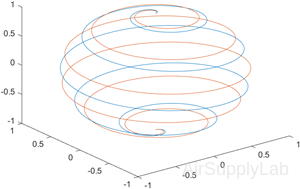
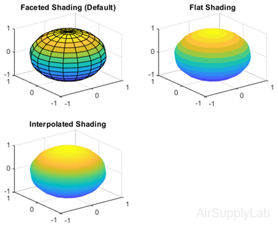
Display Sphere with Different Types of Shading
Plot the sphere function and use different types of shading.
| >> figure >> subplot(2,2,1) >> sphere(16) >> title('Faceted Shading (Default)') >> subplot(2,2,2) >> sphere(16) >> shading flat >> title('Flat Shading') >> subplot(2,2,3) >> sphere(16) >> shading interp >> title('Interpolated Shading') |
 |
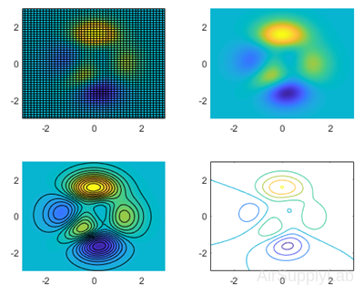
Display peaks with Different Types of Shading
MATLAB includes a sample function called peaks that generates the x, y, and z matrices of an interesting surface that looks like a mountain range:
| >> [x,y,z] = peaks; >> subplot(2,2,1) >> pcolor(x,y,z) >> subplot(2,2,2) >> pcolor(x,y,z) >> shading interp >> subplot(2,2,3) >> pcolor(x,y,z) >> shading interp >> hold on >> contour(x,y,z,20,'k') >> subplot(2,2,4) >> contour(x,y,z) |
 |
Practice Exercise 4.2
- Create a vector x of values from 0 to 20π, with a spacing of π/100. Define vectors y and z as \(y = x\sin (x)\) and \(z = x\cos (x)\)
- Create an x-y plot of x and y.
- Create a polar plot of x and y.
- Create a three-dimensional plot of x, y, and z. Don't forget a title and labels.
4.3 Editing Plots
After you create a plot, you can edit it without placing any command. MATLAB provides the tools menu that allows you to change the way the plot looks, by zooming in or out, changing the aspect ratio, etc.
For example, use sphere to create a demo plotting, as shown in the following figure:
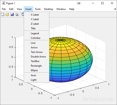
In the figure, the Insert menu has been selected. You can insert labels, title, legend, colorbar, ... and so on.
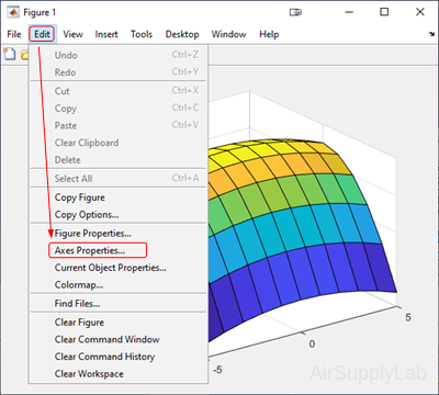
You also can add or change labels, title, color,... through the Edit → Axes Properties from the menu toolbar.
Creating Plots from the Workspace Window
You also can create plots interactively from the workspace window.
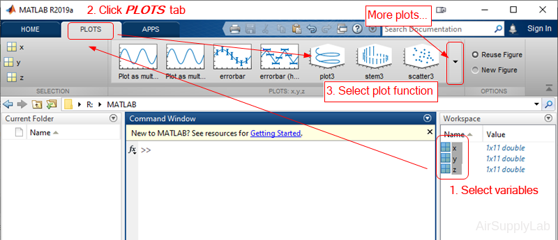
- Select the variables you want to plot.
- Click PLOT tab.
(MATLAB will list the plotting options that are reasonable for the data stored in the variables you selected.) - Select the plotting function to create the plot graph.
Simply select the appropriate plotting icons, and your plot will be created in the current Figure Window. If you don't like any of the suggested types of plot, click the More Plot button, and the system will show you the complete list of available plotting options for you to choose from.
Saving Your Plots
You can save the plots in MATLAB. There are serveral ways to do so:
- If you created the plot with programming code stored in an M-file, simply rerunning the code, and it will re-create the figure.
- In the figure window, using the Save As... option to save the figure.
(To retrieve the figure, you can use open <figurename.fig> command to reload it.) - Move your mouse cursor on the figure, a tool bar will be displayed on the top of the figure. Click the export...
 icon to export the figure.
- You can select Edit menu from the menu bar, then select Copy Figure, and paste the figure into another document.
Questions
- Plot the following functions on the same graph for x values from -π to π, selecting spacing to create a smooth plot:
\(y1 = \sin (x)\)
\(y2 = \sin (2x)\)
\(y3 = \sin (3x)\) - Adjust the plot created in Question 1 so that:
• Line 1 is red and dashed.
• Line 2 is blue and solid.
• Line 3 is green and dotted.
Do not include markers on any of the graphs. In general, markers are included only on plots of measured data, not for calculated values. - Write the commands for drawing the curve:
\(f(x,y) = - {\left( {\frac{x}{5}} \right)^2} - {\left( {\frac{y}{2}} \right)^2} - 16\)
for -5 ≤ x ≤ 5 and -5 ≤ y ≤ 5. Using the surf function. (You may need to review Lab03,Session 3.3) - When interest is compounded continuously, the following equation represents the growth of your savings:
\(P = {P_0} \cdot {e^{r \cdot t}}\)
In this equation,
\(P\) current balance
\({P_0}\) initial balance
\(r\) growth constant, expressed as a decimal fraction
\(t\) time invested.
Determine the amount in your account at the end of each year if you invest $1000 at 8% (0.08) for 30 years. (Make a table.)
Create a figure with four subplots. Plot time on the x-axis and current balance P on the y-axis.- In the first quadrant, plot t versus P in a rectangular coordinate system.
- In the second quadrant, plot t versus P, scaling the x-axis logarithmically.
- In the third quadrant, plot t versus P, scaling the y-axis logarithmically.
- In the fourth quadrant, plot t versus P, scaling both axes logarithmically
- Using subplots to create the plots in this question. Let the vector
G = [68, 83, 61, 70, 75, 82, 57, 5, 76, 85, 62, 71, 96, 78, 76, 68, 72, 75, 83, 93]
represent the distribution of the final grades in the EE3001 course.- Use MATLAB to sort the data and create a bar of the scores. (Use help sort to get the detail information)
- Create a histogram of the scores, using histogram.
- Assume the following grading scheme is used
A > 90 to 100
B > 80 to 90
C > 70 to 80
D > 60 to 70
E > 0 to 60
Use the histogram function and an appropriate edges vector to create a histogram showing the grade distribution. - Repeat part c but normalize the data using the 'countdensity' option.